Evening. I originally designed this bird shape as a papercut within the machine itself. However, as it turns out, I've not actually seen my camera since Christmas Day so I assume it's still at the parentals' house. So this project has been done using the Free Brother Canvas software to then be transferred to the machine for cutting. Eventually if I ever remember to ask the parentals, I may well have my camera back. But for now, Canvas all the way!
This Project uses basic shapes in Canvas to create a 3 colour papercraft Cardinal Bird in the style of Charley Harper, a mid 20th century American designer. If all goes well, it will look like this:
 |
| Charley Harper style Cardinal papercraft bird |
Wondering what Charley Harper's actual style was? Well it's this:
 | |
| Find out more at the official website https://www.charleyharperartstudio.com/ |
You can choose to make YOUR own elements of this bird as blocky or fluid as you like, by adjusting the proportions and angles of each element you use.
DESIGNING YOUR OWN WORK INSPIRED BY SOMEONE ELSE'S
A couple of thoughts about taking inspiration from someone else's design:
1. Don't steal their copyright with a direct copy. It's not just that it's illegal, it's also terribly bad manners.
2. Credit the designer for the inspiration they gave you. Don't just say 'oh look what I made' unless it actually came out of your own imagination. It's only polite!
3. Certainly don't just assume you can sell what you designed as YOUR OWN design, unless YOUR OWN design is significantly different in material ways to the original you took inspiration from. If you don't know what constitutes 'materially different' for copyright, google is your friend! go look it up! In the UK the British Museum has a useful department with lots of information about copyright etc. For your own country you'll have to go find out for yourself.
NOTE: Yeah this means that I'd not be happy if you took exactly this Cardinal, made it up and used it in your commercial business. But if you did this Cardinal as a learning curve to learn how to do things like this, then created your own different one, still recognisably a Cardinal and still recognisably Charley Harper but not materially identical to mine or his work, then neither me nor Charley Harper's Estate could, or would, want to do anything about it. Actually I'd be thrilled if it was a springboard for your own designs!
TRANSLATING INSPIRATION FROM ONE MEDIA TO ANOTHER - PAINTING TO PAPERCUT
Now a couple of thoughts on how to take inspiration from someone else's design that uses a different media and translate it into something that works with the ScanNCut (or any other) machine or different media.
1. This original is an artwork, painted or screenprinted onto a single piece of paper. Charley Harper therefore didn't have to think about how each 'detached' shape would need to connect to each other so it didn't fall into confetti. With papercut shapes, yeah we have to consider this, so for example,
- Charley's Cardinal tail, the sharp point of the angle only just touches the roundness of the body. That makes a VERY weak join for a papercut. So, we need to design it so that the tail joins the body at a thicker part of the triangle to make a more robust join.
- Another example is the Beak - the machine has a basic shape very like the shape of Charley's beak. But if I'm doing a papercut bird, it's easier to have two separate triangles in orange glued slightly apart onto the black bib, than it is to have a black bib layered with a solid beak shape then a fiddly tiny black line on top. Of course, one could take the SNC basic shape and divide it in Canvas so it makes separate triangles, but I chose not to. YOU can choose to do it that way if you'd like to.
2. I made my own design choices, I decided I wanted a slightly different angle for the Cardinal tail, and also for the wings to stick out at a jaunty angle. It's those sort of changes that make my Cardinal 'in the style of' rather than 'a copy of' Charley Harper's work. I also decided I wanted the eyes to be quite big and googly. I think this looks 'friendlier' than small eyes which would look 'beady and gimlet' and less friendly. When using work as an inspiration, you choose the design decisions you make for size and shape and proportion, you don't follow the original slavishly.
3. I made my own choices as to colour, mostly limited by the actual coloured card I had on hand. If I'd had 2 shades of red, I wouldn't have used orange for example.
4. When taking the ideas of a design into a different format for example a painting into a papercut, you have to think of layers, and also how those layers fit together. EACH layer needs to be properly supported by the one below so that it has an integrity and has areas you can glue one layer to another.
So for example, if you chose to have vertical wings rather than at a jaunty angle - you can't just create a body that's the same shape as the Charley Harper one, with straight edges, you NEED to have the same or a similar shape as the wings as part of the body, underneath the wings, so you can glue your wing to the body. Otherwise, you'd just have two pieces of card that butted against each other and needed to be glued onto a background.
Although, if you were choosing to make this shape to be glued onto a background, not to be 'freestanding' like this one (in due course I'm going to punch a hole in the head and have it as a strung decoration) - then you may not want all the layers! You may want the pieces to fit together like a jigsaw all in a single layer so that the shapes are next to instead of on top of each other. (I'll do a blogpost eventually on how to make this layered design into a single layer of shapes that butt onto each other, cos it's a useful thing to know how to do - particularly with for example vinyl where you may not want to layer and can use registration marks so it fits together perfectly)
5. In summary - proper preparation prevents poor performance! A great deal of the time spent designing is spent THINKING. Working out how a design fits together in a physical way, how the design will be used, what size it needs to be when finished etc.
6. There's nothing wrong, and it's probably a very good idea NOT ONLY to draw a rough sketch of your ideas on a piece of paper, but also to get the machine to cut out the different elements you are going to combine, the sizes may not be right (though you can recut if needed by hand until it's approximate which will help you when you actually start designing in Canvas), but you will get a good idea of how it might look.
MY PROCESS FOR DESIGNING THIS CARDINAL BIRD
So, bearing all that in mind, how did I design my Cardinal?
A. I saw the Charley Harper birds on Pinterest. I've always loved Cardinals. I love mid-century design. I love Charley Harper's work.
B. I wanted to create a freestanding (not attached to a background) papercut in a limited number of colours, with layers, that I could use as a strung decoration. I have a tradition of making a papercut item, usually that is strung to be hung up, to include in my christmas cards to friends. So this was a design that may potentially work for that purpose.
C. I looked at Charley Harper's Cardinals, he designed them face on, side on, individually, in flocks: all different ways. I looked at the sorts of shapes he used, at the apparent simplicity of form that suggested the subject rather than was a photographic style replication - we know what a cardinal looks like, it has a distinctive shape and colouring, so we don't need it to have every single feather drawn in. Or any feathers. I looked at his use of colour - traditionally screenprinting was 5 or fewer (and colours were overlapped to create additional shades, but you can't do that with solid paper cuts!), I liked the idea of 3 colours with no shading.
D. I looked at the booklet of Patterns that came with my ScanNCut and had a think about how I could WELD, RESIZE and ROTATE patterns to make the individual shapes I would need to create the characteristic form of Charley Harper's birds.
E. I got a pencil and drew out the basic shapes that would need to be used before welding, and worked out how many layers I would need (three) and in what colours -
-layer 1 - red for the body, crest and tail
-layer 2 - black for the eyes, face and bib
-layer 3 - orange for the beak and wing parts
I worked out I needed
-For the body - a basic circle for the body, some sort of triangle or teardrop for the crest, and a triangle for the tail.
- For the eyes and face - two basic circles for the eyes, and a shield shape for the face/bib
- For the beak and wing - two basic triangles for the beak (this is where I realised that it was easier to have 2 separate triangles rather than a complete beak and an additional black rectangle to denote the beak being slightly open)
and then I got stuck. On the wings. There IS no basic shape directly approximate to the wing shape I wanted in the Machine itself. (I designed this before I knew how to use Canvas and do node editing). The semi-circle shape didn't quite have the sharp points I wanted for the wings. So I had a VERY careful look at the booklet of Patterns, particularly at the quilt blocks. And realised there was a perfectly shaped semi-circular pattern in one of the quilt blocks. Boom! my cardinal was possible!
From the booklet - the Basic shapes used are:
Layer 1- Red
Body - BA A045 circle
Crest - BA A094 teardrop
Tail - BA A039 triangle (rotated 310 degrees)
Layer 2 - Black
Eyes - BA A045 circle
Face/Bib - BA A110 shield (rotated 90 degrees)
Layer 3 - Orange
Beak - BA A033
Plus
Quilt Block Shapes:
Wings - PA B063 (rotated 180 degrees)
Annoyingly, Canvas doesn't actually NAME shapes or fonts, there's no label when you hover over them. I am seriously considering asking Brother to add labels so it's easier to keep track of what's been used for when I'm altering a design later, or using the original as a springboard for another.
HOW TO MAKE THIS CARDINAL DESIGN IN CANVAS
NOTE: If you don't know how to do anything like Resizing or Change Colour or Weld or Rotate or the other actions we do in this Project - go and read this blogpost HERE before you start doing this one. Because I didn't do screen shots for every single step, sorry!
1. Start with a New Project I'm assuming you have already created a free login and have opened Canvas

Open a New Project - the first icon on the opening screen, a small white mat in a grey background.
2. Open Basic Shapes This is the menu bar on the left hand side. By scrolling up and down within Basic Shapes you can access all the shapes we need for this Project from there.

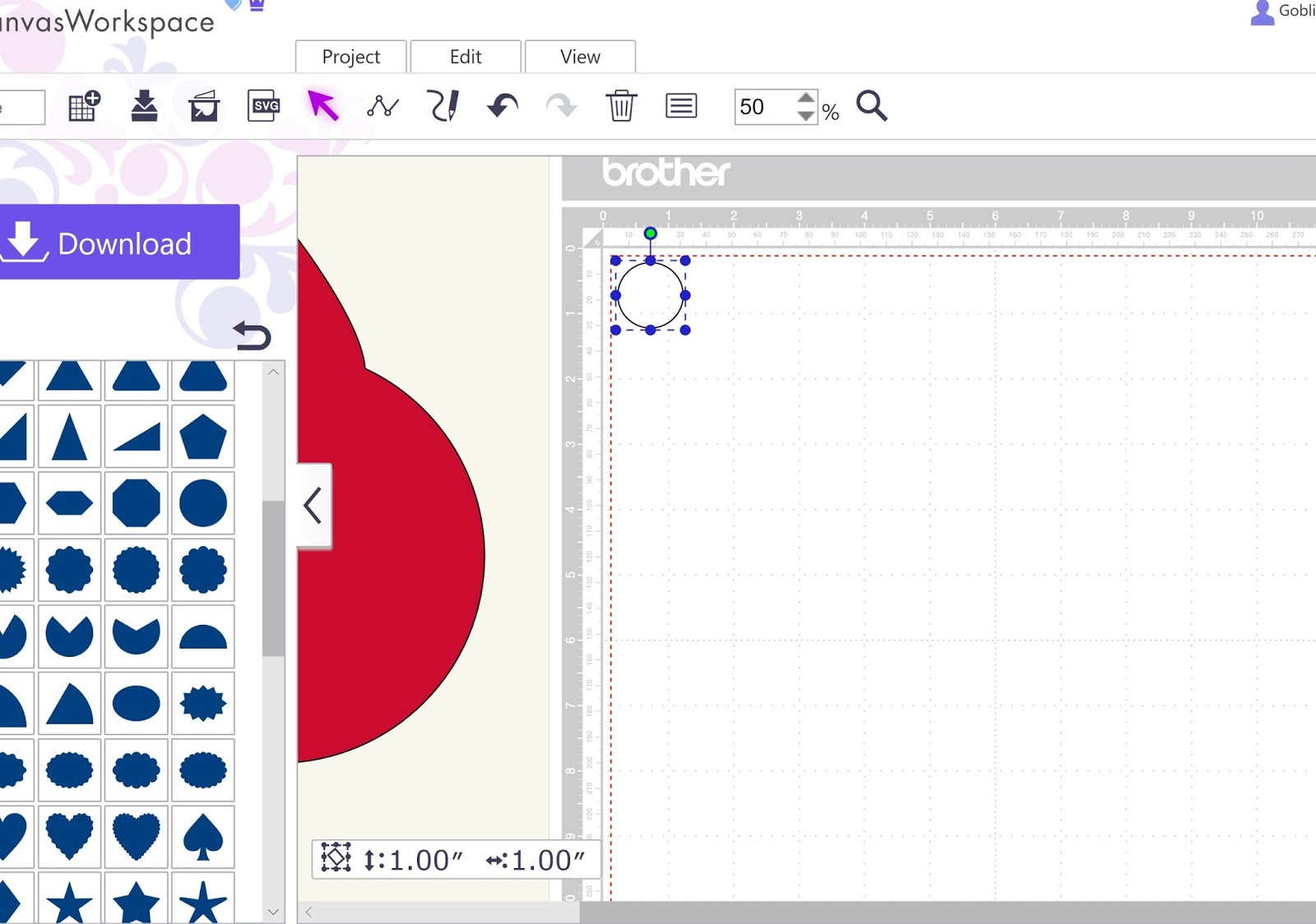
3. Bring basic shapes onto the mat - Circle for body. There's 2 ways of doing this, (1) a single left click, makes the shape jump to the top left corner of the mat or (2) left click and hold down and drag the chosen shape onto the mat, lets you position it where you want it on the mat.
First shape is a basic CIRCLE - scroll down until you've found it - if you hover your cursor over it, it turns purple.

and then click and take it onto the mat.


5. Change Colours - as you know from earlier posts, I like to colour my shapes, so that I can tell whether or not Canvas has actually performed the action I asked it to. REMEMBER - colours are LOST when you transfer a file to the machine, so they're only useful to monitor process actions and/or for guidance for assembling your design after it's been cut.
Highlight the Circle, right click, choose Properties, click the Bucket Colour picklist in the Color Section and choose RED. Leave the Properties screen open (you can use the sliders to move the image to the side if the Properties box is in the way)
Then Highlight the TearDrop, and use the same Picklist to change the colour to Orange.

Make sure you have your Teardrop overlapping as much as you think is appropriate - I always use the blue outline as a guide, so here above, you can see that I pretty much moved the teardrop until the middle blue dots met the outline of the red circle to decide the placement of the overlap.
6. Align Vertically - To make sure that the Crest teardrop is going to line up on a vertical axis with the body, highlight BOTH shapes, open the Edit Tab at the top of the mat (above the row of icons), and in the Align Section, choose the SECOND one, Centre Align.

This will mean that the teardrop and the circle will be centred so that the shapes are equal on each side of an imaginary vertical line. (You can't use Align for the overlap we did at 5 above, because they are offset).
7. Order Layers Before Welding - When you weld, Canvas takes the top layer and welds everything to that layer. It doesn't matter so much with this shape, but it's good to get into the habit.
If the red circle is the top layer, the weld will finish as red. If the orange teardrop is the top layer, the weld will finish as orange.
So highlight the red circle, open the Edit Tab, and in the Order Section, click the first icon - Bring to Front.


Once you are finally happy with the proportions, move the shape off the mat to the side to give yourself working space (when doing this in the machine, you can't use the space outside the mat, with Canvas you can, it's one of the reasons I find Canvas easier to design in than the machine, that and there's more functionality.

9. Start Layer 2 - the eyes and face/bib. Scroll in the Basic Shapes menu and create a single circle on the mat


You will end up with two identical black circles - I moved mine slightly apart after duplicating.

13. Create a Shield shape - scroll down the Basics menu on the left hand side until you find the Shield shape (it's on it's side, looks like a mirror/ back to front D shape)


Two ways to do this, (1) use the little green dot handle at the top of the shape when highlighted by holding your cursor on it and moving your mouse in a circular motion or (2) more precisely, right click, choose properties, and

In the Rotate Icon section, type 271 and click the minus button highlighted (no I don't know why you have to be one degree out, but it works. The other way to do it is to type 270 and then click outside somewhere inactive in the Properties box).


Hurrah! And no I don't know why just typing 90 degrees doesn't work, at least it wouldn't for me...
15. Colour your rotated Shield shape in black - as before, right click, properties, Colour section, bucket picklist to black.


Remember you want it to look like a beady eye sticking out, so you want LESS than a quarter of the eye to touch the shield, so that a viewer can see that the eye is a circle (and assumes the outside edge of the line of the eye continues to make a full circle like an eye even though it is welded). You are fooling the viewer into thinking the face/bib and the eye are separate individual elements, even though they aren't. (See my post on Designing Papercuts - Bridges/Connections for some thoughts on how the eye is fooled by pattern and placement HERE).
Again the absolute placement is YOUR choice. If you aren't happy, fiddle around until you are!
18. Repeat the same action with the other circle to make the other eye. Again I lined up the middle blue dot at the bottom of the circle with the side edge of the shield, and the top of the shield goes between the second and third blue dashes on the right of the circle.

Once you are absolutely happy it looks good, highlight all 3 shapes - by holding your cursor down and sweeping the mouse so that the shapes are all surrounded by their own individual blue box.

19. Weld the eyes to the face/bib. As before, once your shapes are all highlighted, click the Edit tab at the top of the screen above the tool bar, the bottom section Process Function, click the first icon Weld.

It should look like this once welded.

To do this, bring the body from the side back onto the mat.

If your black layer goes behind the red layer - go to Edit Tab, and move the Layers around using the Order Section as you did above with the red/orange shapes at the beginning.
Assuming your layers are in the right order, put the eyes shape roughly where it should be so that the eyes cover the place where the crest and the body join in the welded red shape, then align them vertically, as you did before with the red/orange body shapes. Go to the Edit tab, and click on Align Section, second icon Vertical. This will centre the eyes on the body shape.
Then resize the eyes black shape so that the width of the eyes is in proportion to the width of the crest, and the bib length is in proportion to the length of the body. The easiest way to do this is to use the blue dots when you have the eyes shape highlighted.
Diagonal dots - resize in proportion so if overall the eyes shape is too big or too little, move the diagonal dots.
Middle dots at the sides - resize ONLY the width of the shape
Middle dots at the top and bottom - resize ONLY the height of the shape.
I found I needed to use the diagonal to make mine a little smaller overall, then the middle dots to stretch the eyes apart to cover less of the crest, and then the bottom dot to move the bib up to take up less of the body.
If you've used your OWN sizing for any of the elements so far, yours won't be the same size as mine BUT I did screenshots and INCLUDED the measurements tag at the bottom left, so you should be able to see what sizes my two shapes ended up at to give you an idea of where you might want to be.
Yes you can use the Properties box and the tick box for keeping proportion or not but I find the blue dots easier for this particular action.


If you are ever working with shapes and some are too small for you to pick up by eye and the cursor, remember you can use the Edit Tab and Order Icons to bring the small shape to the top so that you can highlight and work with it.
Oh, and in case you were wondering why we've not put the tail on yet, it's so that we can use the Align function to get the black eyes, and later the orange beak centered so we can resize them easily. As soon as you put the tail on, align centre doesn't work any more.
21. Temporarily group these two shapes. We temporarily group these two shapes so we can move them to the side, but also, once we've built the beak shapes, can resize those in comparison to the black and red together without worrying that we're going to accidentally resize the eyes instead of the beak (as they're very close together). Yes we have an undo button but in the heat of the moment of frustration, that's often forgotten.
So. Highlight both shapes, Edit Tab, Group Section, first icon - Group.

22. Layer 3 - the beak - get your basic shape triangle. Go to basic shapes, scroll until you find the right triangle, you want one that's equal on both of the top sides. If I'd paid more attention in maths at school I'd be able to name it. I can't. So, here's a picture of which one you need:

Right next to the triangle I've picked, to the left, you can see there's a diamond shape, upside down, that could look a lot more like a Charley Harper beak. But I chose this one.
23. Resize the triangle to make it wider, and also squished downwards. Use the bottom and top middle blue dots to adjust the height so it's squished downwards, and the middle left and right blue dots to adjust the width.
Mine ended up looking like this:

You can see the final measurements in the screenshot, and could use the Properties screen (having unticked the box for maintaining ratio) and type in those measurements to get the right size.
24. Colour it orange. That's right click properties, colour section, colour bucket. But you know this, we've done it several times already in this project.


So. Rotate. Either with the little green circle on the highlighted shape or right click/properties and the Rotate section as we did with the shield for the face/bib black layer above.

And then move the lower beak down to just below the upper beak shape. It's a good idea to Align them - edit tab, align section, second icon - so that they are even on both sides.
You want to place them so that there's a little space between them, so that it looks like the beak is slightly open.

27. Resize the Beak in comparison to the body and eyes. Bring the red body and black eyes/face group back onto the mat.


This is my final arrangement, and you can see the total height and width of the orange group in the bottom left measurements area.
28. Move both the red/black and the Orange groups off to the side. Don't ungroup anything at this stage.

NOTE OF CAUTION: Right up until this point, everything we have done in Canvas can ALSO be done in the Machine itself. Obviously the layout is different, but the same functions exist in the Machine as in Canvas.
However, for the wings - the machine can't do node editing - so if you are doing this in the Machine, you need to get Quilt Block shapes PA B063, the semi circle elipse, and rotate them to vertical and then duplicate and then flip one so you have two wing shapes. Then resize them compared to the body of the bird.
For Canvas: we need to do a bit of node editing because the exact shape we need doesn't exist in Canvas. Now I've not blogged about Node Edit functions much yet. But all we are going to do is move two Control Points about 45 degrees, so if you follow the instructions EXACTLY you should be able to do the following.
If it proves too difficult, then go to the machine, pull up the Quilt Block Shape PA B063, put it on the mat, and save the semi circle elipse to usb/cable/wifi and bring it into Canvas, and as it's already the right shape you can ignore the Node Editing bit. Or, you could just use the squished semi circle without worrying that it has rounded instead of pointy ends. Your choice!
Ok so. Onto the Wings. In Canvas, doing Node Editing to make the ends of the wings suitably pointy.
Go to the Basic Shapes and create a semi-circle.


This is what mine looked like - with measurements box at the bottom.


You can see the degrees I rotated mine to, and I think it's the right size and shape for my bird. If your measurements are a bit different to mine, yours may need rotating differently - you can use the Plus and Minus buttons in Properties Rotate Section to move by increments of 1 degree each way at a time.
36. Node Editing - this is SOLELY for people who want a sharper edge to the wings. If you are happy with your semi-circle as it is, skip this step.
So, node editing. Here's a quick overview:
- Every line on Canvas starts and ends with a NODE. A little bright blue dot.
- And every time the shape changes direction - there is EITHER another node for the line to pivot on (particularly with straight lines) OR alternatively, a NODE WITH A CONTROL POINT that determines the direction and severity of a curve at the beginning at end of that particular section.
- By swinging the control point as though it's the tip of a minute hand on a clock, you can alter the ANGLE of the curve - make it sharper or broader (which is what we will be doing)
- By pulling the control point away from the node, or moving it closer to the node, you can alter the apex of the curve, creating bumps outwards or bumps inwards.
- By combining the two ways a control point can move, you can make waves, or quite complicated shapes with a single line between two node points.
- CONTROL POINTS can either be not showing, not there (straight) or exist in pairs.
- Pairs of Control Points can either be set to mirror each other, or to move independently of each other.
- Nodes and Control Points can be created using the Path Tool (see this post HERE) OR they can be created, removed and edited using the NODE EDITING mode.
- The NODE EDITING MODE is entered by DOUBLE LEFT CLICK on the OUTLINE of a shape that is highlighted. NOT by doubleclicking on the blue highlighted outline.
- When Node Editing Mode is in operation, the shape changes so that the 'live' node line is bright blue, and a splash screen comes up.
- The splash screen has a picklist for whether the particular live node line is straight or curved
- Then there are icons, the first one toggles on or off for whether the control points are going to work together (ie a mirror image on each side of the node - the line on both sides of the node does the same thing) or independently (ie the line on each side of the node does different things). When a node has a straight line on one side and a curved line on the other there is only ONE control point showing.
- The second icon ADDS a node.
- The third icon DELETES a node.
- The fourth and final icon ENDS a node. This enables a node to have only ONE line instead of TWO. You'd mostly find this if you wanted to do a single cut line that's not attached to anything else. Usually Nodes have 2 lines coming from/to them. It is also possible to use this icon to open or close a shape.
What we want to use Node Editing to do, is to SHARPEN THE CORNERS of the wings. And to do that, we will need to put our cursor on the correct Control Point and without moving it towards or away from the Live Node, just change the angle of the curve by swinging the Control Point (as though it's a minute hand moving around a clock face) by about 45 degrees (ie half of a 90 degree right angle). It's not as difficult as it sounds! Honestly! but it does take a bit of practice.
So at this stage I suggest you SAVE what's in Canvas so far, as a New Project - Firstly Name your project in the Name box to the left above the Basic shapes area above the task bar then go to Project Tab (to the left of the Edit Tab) third icon along, looks like a filing tray with a plus sign, labelled Save as another project. click. Wait for it to save. It'll say it's saved, then the screen will go blank then come back again.
Ok so. you saved it. Now what?
A - Move everything except the orange wing shape to the side of the mat, zoom to 100 as a minimum. Have the orange wing highlighted.


It's THIS horizontal control point you are going to be moving. You need to put your cursor onto the control point at the end of the stalk - it does have a darker blue outline, that's a node. The control point is the circle that's off in the air to the right.
E. Very carefully put your cursor on the control point, and as though the control point is the tip of a minute hand on a clock, currently at 3 o'clock, holding down your left mouse button, move the tip down to about 5 o'clock. It should look like the screenshot below. You can see that by moving the tip of the minute hand from 3pm to about 5pm, the curve has been flattened out a bit, so the point of the wing now looks sharper. Have a play around if you want so you see what happens if say you move the control point to 6 o'clock or 12 o'clock etc. Just DON'T move the control point towards or away from the node, because that'll change the apex of the curve and you'll have to undo and start again from A. (which is why we saved the project before starting.)


If you want to check the position without the control points in the way, the Splash Screen that has the Node Editing controls has a little tick box, untick it, and you won't see the control points, you can see the shape better. Tick it again and they come back.

And Phew! we are DONE with node editing for today!

37. Duplicate your newly edited wing. Right click, 4th line down.

38. Then flip the duplicate. You do this by going to Edit Tab, Flip Section and clicking the first icon.

39. Then move the wings off to the side and bring the red/black body onto the mat. It's time for the TAIL!!!!


47. All the shapes are now created. So, what's left? we need to arrange them on the Mat so that they are in the right place for being cut out in the machine.
So. Bring all the pieces back onto the mat - the red shape, the black shape, the grouped beak and the two wings.

Organise them so that they are together in terms of colour with in the mat. Canvas won't save if there's anything outside the cutting area of the mat, so don't go too close to the edges.
REMEMBER the machine ignores colour. It's the USER who decides what colour each shape will be. I've decided to use only 3 colours.
Now, as you will recall or not, the beginning of this post feels like it was a verrrry loooong time ago! I have no camera at the moment. So, I have, in Canvas made a mockup of what happens next:
1. To cut out the pieces in the right colour YOU need to put the right colour pieces of paper on the mat. You do a background scan so that the machine screen tells you where the edges of the paper are.
So in Canvas I did a quick mockup of what a mat would look like if you used minimum of paper per shape (I ungrouped the beak and moved the bits around to reduce wastage. And I turned the eyes/face cut lines white so you can see them on the black 'paper'). You DON'T recreate this, this is purely because I don't have a camera to be able to photograph what the paper and shapes arrangement would look like on the machine screen.

2. So, if you arrange YOUR shapes on YOUR Canvas screen like this, and then SAVE your project. You KNOW that when the design goes to the Machine, everything is in the right place ready to cut (after doing test cuts) straight from loading the file.

3. When the file goes to the machine, as the machine ignores colours, this below is what the file will look like in the machine. This is one of the reasons I use colours in Canvas, by having colours in the Canvas file, it's a good aide memoire for the colours of paper I need to put on the mat!


oof! that was very long. But hopefully, useful. By doing the whole design step by step from inception to final design, hopefully it's helped those of us who are not quite sure about creating our own designs to see that if it's approached with a bit of preparation and in logical steps, using the same few actions of CREATE, RESIZE, WELD, ROTATE, FLIP, ORDER and COLOUR, it's not that hard to do.
Once you are familiar with the various actions, it may only take a couple of hours to put together a reasonably complex design from inception to finished and assembled cut!
No idea what's next. Maybe taking elements of this post and using Node Editing to make the shapes less blocky, more curved. Also, maybe creating the same image but in a single layer, like a jigsaw, for applique where you don't want lots of layers, and possibly also how to do registration marks for the various layers for if vinyl was being used rather than paper. But that'll be in the distant future, I've got other plans first.
No comments:
Post a Comment